 A Tag Analysis: Romance in K-Dramas - Conclusion

Welcome to Part Two of the Common Visual Cues Found in K-dramas. Like I mentioned in my previous article, I initially planned to cover all the cues briefly in a single article. But once I started writing the first article, I realized that there was too much ground to cover, which led me to split the article in two, believing that would be enough.
However, after some feedback (thank you to those who left a comment) and structuring of the remaining cues, it became apparent that this approach wouldn't do either. So, instead, I'm going to cover the remaining cues over the course of several articles in an effort to make them "bite-sized" and, thereby, easier to digest and/or assimilate.
This following table shows the new structure I've come up with and which I'll try to adhere to. Think about it as an index for this and the next series of articles:
INDEX | |
|---|---|
| PART ONE (read here) | Covered two of the most common cues used to establish interpersonal relationships. |
PARTS TWO - FOUR will cover two of the most common interpersonal cues. Meaning, cues used to establish a character's state of mind or his/her "process of introspection". The fourth article will cover several examples where more than one cue is being used in a scene or shot. | |
| PART TWO (current article) | Interpersonal Cues: Boxing |
| PART Three (read here) | Interpersonal Cues: The Dutch Angle |
| PART FOUR | Interpersonal Cues: Overview |
POPULAR MOTIFS IN K-DRAMASThis will be a different series of articles but on a similar vein. These set will cover prevalent motifs used in k-dramas to build an additional narrative within the story. I'll be covering one motif and it's variations per article. Once I start working on them, the structure may change. | |
| PART ONE | Popular Motifs in K-Dramas: Mirrors, Windows & Reflections |
| PART TWO | Popular Motifs in K-Dramas: Rain, Water & Submerging |
| PART THREE | Popular Motifs in K-Dramas: Feet, Shoes & Direction |
Except for part four, each article will be independent, so you won't need to read them all to enjoy them. Having said that, I still encourage you to check out part one (either before this article or after) since it'll give you insight into some techniques that might increase your appreciation and enjoyment of Korean dramas.
And, as I mentioned before...
The cues I'm about to cover stand out because they add more than just composition to a shot.They add a subtext which most times reinforces the narrative... but which may also, at times, contradict the script purposely. |
Though some of you may see these cues merely as aesthetic choices, doing so would be rendering a great disservice to the directors and the mastery they hold over their craft. Every art form focused on storytelling requires knowledge of colors, design, composition, and hierarchy -- among many others, to communicate things appropriately.
Once you know what to look for, you'll come to appreciate that choices that seem aesthetic, may actually be communicating more than you'd realize.
Keep in mind that this is also my personal interpretation of the cues within each example. Your take on what the director was communicating in some of them may differ from mine. Perhaps you saw more or you saw less. If so, please share your opinion in the comments down below. I'd love to hear your thoughts and discuss things I might've missed!
With that said, let's take a look at some intrapersonal examples in K-dramas established through boxing.
The first set covers visual ways to establish a character'sVULNERABILITY, SOLITUDE &/OR FEAR.(╥﹏╥) |
This may be one of the more common compositions used in K-dramas. So much so, I don't think I've watched a drama that doesn't use it at least once. Like with the cues covered in part one, the director establishes a lot of subtext through simple framing.
One thing to keep an eye out for is how much space the character is given within the confines of the box. Usually, the tighter the character is within the frame (the less "space" he's given), the more oppressed, isolated and/or trapped he or she feels.
Let's take a look at some examples:
ISOLATED |
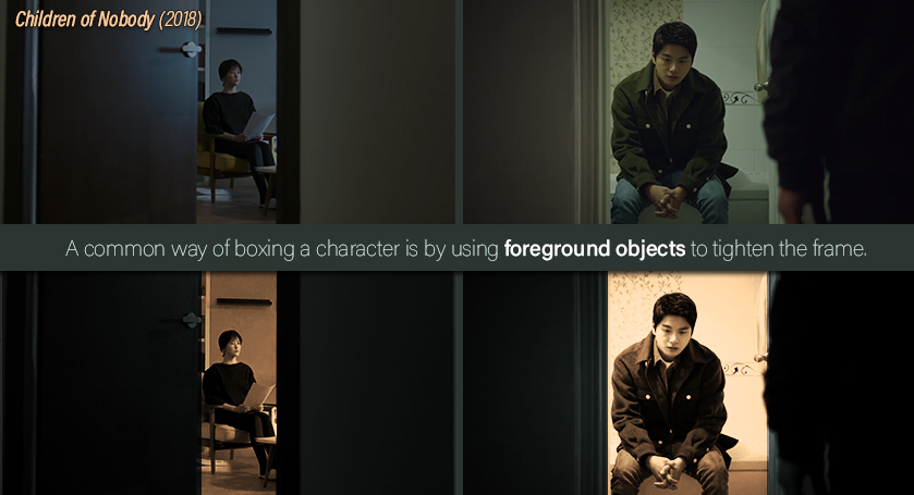
Children of Nobody |
In both of these shots, we have a character framed by a door. The character is given little breathing space, which portrays them as oppressed or trapped by the situation they're facing. This forlorn feeling is reinforced by the dim and cold light, which sets an atmosphere of sadness or hopelessness. Their body language also clues us in on what they're feeling. In the left, we have Cha Woo Kyung (the FL) sitting straight, with her arms tight against her flanks as she looks at something we can't see. Tense and lost would be the perfect way to describe her mood. On the right, Kang Ji Hun (the ML) sits hunched down. His face is cast down and, like with Woo Kyung, he's looking but not seeing anything. He seems tired, disappointed and lonely. An interesting thing to note about these shots is that the camera is stationed outside of the room the characters are occupying. This not only hints that they are feeling isolated from the world around them, but that they are, essentially, keeping us out of their thoughts as well.Another way to look at is, is that they are feeling guarded. However, the fact that the door isn't fully closed implies that they haven't lost all hope. |
OPPRESSIVE |
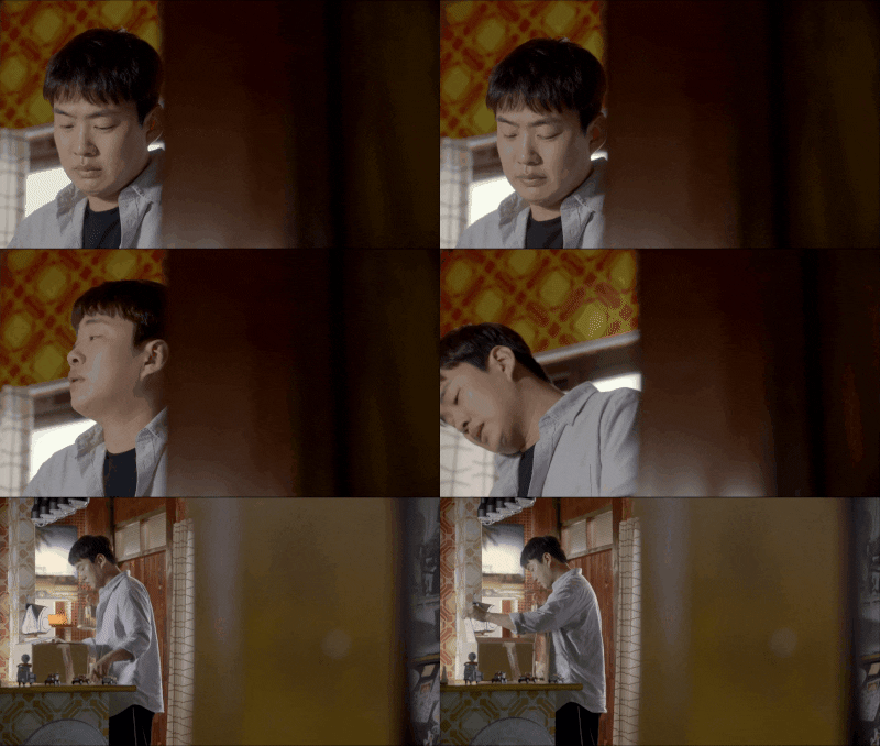
Fight for My Way |
In this scene, we see Kim Joo Man (the 2ML) struggling with his feelings after having hurt someone he cared deeply for. Notice how awkward the composition is. Do you feel uncomfortable watching? If the answer is yes, then the director has accomplished his/her goal. And that's because the director is shooting him from behind a wall, making us complicit in "spying" into Joo Man's moment of vulnerability.We are basically intruding into his pain uninvited. Another thing to analyze is how little space he has within that box, which reinforces his discomfort and introduces a feeling of oppression. Perhaps the director wanted to show us how the weight of Joo Man's actions is emotionally crushing him... |
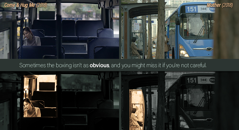
Sometimes the shot is so busy, that the boxing of a character isn't as obvious. So if you're not paying attention, you might miss it. Let's take a look at some examples.
SUBTLE BOXING | |
Come & Hug Me | Mother |
On the left, Ok Hee (the ML's adoptive mom) sits on a bus after having visited someone in jail and getting a reality check that "just because he's behind bars, doesn't mean he can't do anything". Her body language shows her exhaustion and dejection, which is also reinforced by the cold light. This isn't a happy day and the director wants to make sure that's clear. Add to that the fact that she's boxed into her seat despite the bus being empty, and we have someone who isn't just tired, but who's psychologically caged by the monster sitting behind bars.On the right, Soo Jin (the FL) sits at a bus station after having had a difficult day. Notice how, like with Ok Hee, her body language suggests she's tired. She's hunched down and looking down, with her hands fisted on her lap. Though she's boxed tighter than Ok Hee, the neutral colors keep the shot from becoming depressing. She may not see a way out right now, but she isn't out of the battle yet. | |
We may, of course, come across the opposite of subtle boxing: dramatic boxing. This type is not only hard to miss, but it usually has more of a punch visually as well as metaphorically. How could it not? With this type of boxing, the director clearly relays that the character is feeling trapped by his or her circumstances.
Let's look at some examples.
DRAMATIC BOXING | |
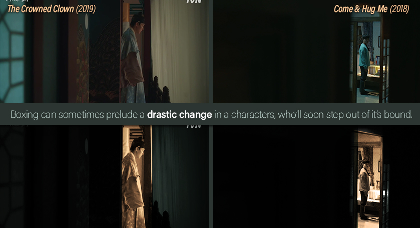
The Crowned Clown | Come & Hug Me |
In both of these scenes, the male leads are about to make a decision that would alter the rest of their life. On the left, Ha Seon (the ML) is caught between a door and a curtain. He's looking straight ahead, with barely any breathing room. The cold and dim lighting externalizes the character's heavy heart. It's abundantly clear that this decision -- whether to stay trapped or pull back the curtain and step out -- cannot be taken lightly.When you consider the premise (a clown acting on the stage that's the palace) of the show, you know this one is a sophisticatedly poetic composition. On the right, Yoon Nah Moo (the ML) is framed by the door. Though he's in profile, he is looking our way, breaking the fourth barrier. Like with Ha Sun, he's given very little breathing room and the cold light dims the scene. However, Nah Moo's tensed body suggests he's ready for the challenge ahead. That and the way he looks out the door and right at us, tells us he's a force to be reckoned with. Perhaps, at any second now, he'll break out of a cage that's become too small to hold him. | |
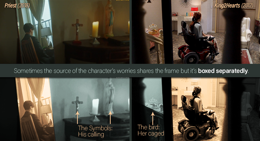
In the last article, I touched upon "poetic division", wherein a frame separates a character from an object that represents another character. This time, we'll take a look at other types of poetic boxing, wherein whatever's worrying the character shares the frame but it's kept out of the character's box; implying the character has yet to make amends with his or her feelings.
Let's take a look at some examples:
POETIC BOXING | |
Priest | King2Hearts |
Notice how in both of these examples, the characters are looking away from the camera. More importantly, they aren't facing the very thing that's causing them grief. As if they are in denial of their situation and would rather look elsewhere than face their problems head-on. On the left, Oh Soo Min's (the ML's) calling is shaken by the discovery of a monumental event from his past. This shot is interesting because we see Soo Min through a mirror's reflection. And mirrors already have a ton of connotations (which is why I'll cover this one in more detail on another article later down the line). In this case, however, the mirror (which is a symbol for enlightenment) is showing us Oh Soo Min's true feelings: that now that he's remembered events from his past, he's not sure if he can make the sacrifice his calling demands. The box also symbolizes that he's trapped between his emotions and his beliefs.On the right, Princess Lee Jae Shin (the 2FL) sits on a wheelchair looking lost and almost helpless. Besides her, we see a beautiful, colorful bird sitting in a cage. In this case, the bird mirrors her situation. She's caged by her wheelchair, unable to enjoy the freedom she took for granted.And no matter how grand her surroundings are, no matter how fancy her wheelchair is... in the end, she's constrained. | |
BONUS SECTION
Boxing Two Characters
(。-_-。 )人( 。-_-。)
While we have already covered grouping through "boxing" in the last article, I want to touch on the subject again but with a different perspective. Mainly, what the characters' stand is, emotionally and/or psychologically speaking, when a director boxes them together. Because while the technique might be the same, what it implies can be vastly different.
- The first thing to take note of is, of course, the context. What event/scene led to the composition in the first place.
- Where they fighting, making amends or simply having a heartfelt conversation?
- Next, we focus on the light's temperature.
- Is it cold (blues and greens), warm (yellows and oranges) or neutral?
- The last thing to consider is what their interaction is within the box.
- Are they hostile, friendly, confrontational or close?
- Are they touching each other or standing apart?
- Are they looking at one another or looking away?
These questions will help you interpret what the director is trying to establish with these key shots. Let's look at some examples of what boxing can signify in regards to the characters' mental or emotional state.
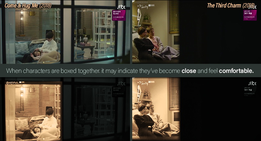
COMFORT & RESPITE | |
The Beauty Inside | The Third Charm |
When a box is meant to be used as a "safe haven" for characters, the light is usually warm giving it a cozy feel. Additionally, notice how in these examples the characters are touching one another. Their body language establishes the sense that they "belong together" or that they share a deep bond. So, in cases where their relationship is established as friendly, you should remember that the tighter the box, the stronger the bond. In the case of The Third Charm, take note that the characters are looking in the same direction. This means that they are looking forward together. And if you've seen the show and know the context, then you understand how beautiful that is. | |
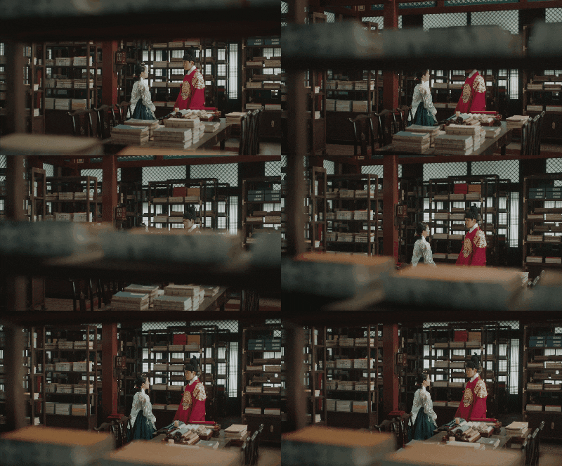
CHANGE |
The Crowned Clown |
Sometimes a decision that seems aesthetic can be anything but, and this one is one of those times. This "pan up shot" happens after our leads had a heart to heart conversation; wherein they shared their true feelings for each other. The camera takes it's time to move up and, as it does, nothing is said or done further between our leads. That alone tells you this shot is important. By shifting them from one box into a higher one, the director may be reinforcing that their relationship "has reached a new level". |
DANGER | |
The Crowned Clown | Come & Hug Me |
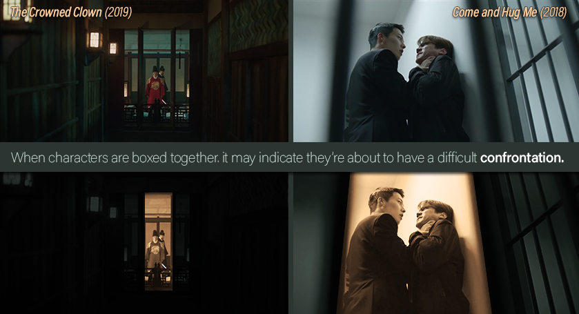
In both of these examples, we get a threatening vibe, wherein the box becomes a dangerous cage. Notice how both of these are also shot with cold light or using cool filters.On the left, that threat isn't as evident, save for the little breathing room they get and the cold temperature. However, once you see this shot in context, you understand that these characters aren't united anymore. The fact that one is giving his back to the other also implies that one character isn't aware of the other as much as he should. On the right, we not only have these characters in a literal cage, but the camera films them at a low angle, adding menace to Nah Moo's (the ML's) actions. Low angles usually convey a sense of power and that's exactly what's happening here. The additional lines of the bars pull the characters even closer, with little breathing space, instilling a sense of palpable hostility. You know the other character's fate is resting, quite literally, on Nah Moo's palm. | |
THE SHOWDOWN | |
Come & Hug Me | Fight for my Way |
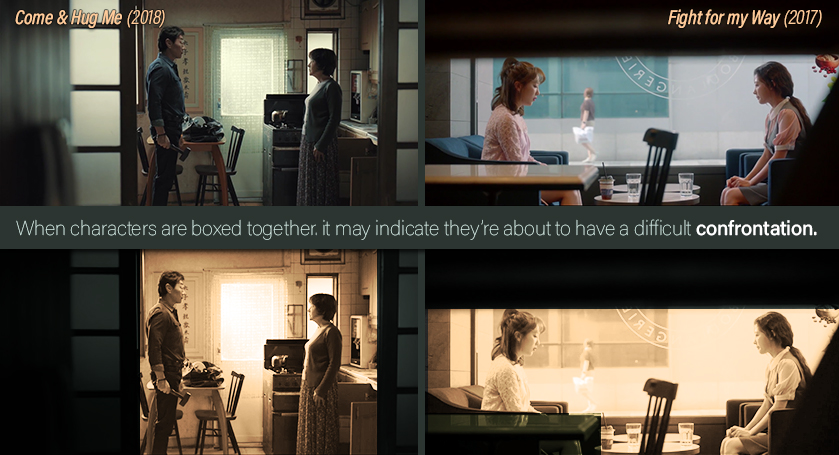
Both of these examples give a feeling that a confrontation is about to take place, even without a context.It's not only their body language that showcases their tension, but also the fact that they are facing each other, with literally no way to hide since the box has forced them to share a small space.Essentially, they are caged together, and one of them holds power over the other. On the right, we have Yoon Hui Yae (the antagonist) almost being pushed towards the lady by the door. Notice how, by positioning him towards the center of the frame, he's claiming more "space" and, therefore, given more power. On the left, we have an awkward framing, with an object cutting through the shot horizontally. The dark space above creates the idea that the girls are being crushed by the tension. It's even more claustrophobic for the girl on the right since she's also squeezed in by the table in the foreground. This implies she's the one with less power. And, if you've seen the show, you know the reason why. | |
That's it for this subject! Thank you so much for reading and, if you've also read the first one, thank you for your interest in the series. Hopefully, this new format is more pleasing to the eye. If so, let me know in the comments down below (so I can re-format the previous article as well).
Also, even though this time I didn't provide much detail of the context of each example as to avoid spoilers, I apologize if one or two fell through despite my precautions.
Did you enjoy the article?
I'd love to hear your thoughts in the comments down below. Here are some questions to get a conversation started:
- Have you noticed these cues before?
- Are there other cues related to intrapersonal relationships that you've picked up in K-dramas and which I might've missed?
- Did you like the "bite-sized" length of the article or do you prefer longer articles?
- Would you rather see more examples in the next article, less or the same?
- Where my explanations clear this time around? Or did you feel like more context for each example would've helped? Do you think it would be better not to mention the name of the series I'm taking the examples of?
- Are you looking forward to the rest of the articles? Is there one in particular that appeals to you? Why or why not?
